
Presenting data without any visuals is a real test of the audience’s attention span and patience. No one appreciates having to go through the trouble of deciphering what the data is trying to say from text alone, or – worse still – straight from a spreadsheet. But whether one is a ‘visual’ learner or not, things are better digested when the data is represented visually.
Whether you want to fill your PowerPoint presentation with charts or graphs or just want to add them at the end to drive home your point, any professional working with data is inevitably going to have to learn how to insert those visual markers into their presentation. Here’s all you need to know about it.
Charts vs. Graphs – What’s the difference?
Although these two forms of visual data presentation are used in each other’s stead at times, they actually serve two different functions.
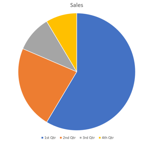
In PowerPoint presentations, charts don’t have to have numerical data. Just representing the information in a structured format suffices to get the point across. Consider charts the umbrella under which data can be organized in a variety of branching ways. A pie chart is a common example that divides the whole into its constituent slices based on the data. It is easy to see the relationship between the slices based on their size alone, without having to include numbers into the mix.
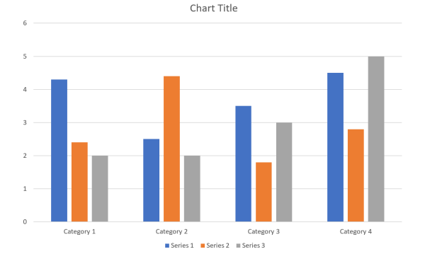
Graphs, on the other hand, are grounded in numerical data. For instance, a basic line graph or a graph with two axes needs numerical data to compare data change over time.
In summation: all graphs are charts, but not all charts are graphs. It is up to you to think and discern which of the two formats – charts or graphs – would be the most effective for your data.
Add charts and graphs in PowerPoint
Now, let’s start adding charts and graphs to your PowerPoint presentation. Open the PPT and create a blank slide. Then, under the Insert tab and click on Chart to get to the chart selection menu.

You will get a variety of charts, including graphs, to choose from. The chart types will be given in the left panel. Click on the one that you think will help you represent your data in the best possible form. Then, pick from the available chart-type variants.

How to input data for your chart and graph
Once you select the chart, a worksheet will appear with placeholder data. Replace this with your own data to customize the chart. You can key in the data one by one, or if you have the data in a separate spreadsheet, copy the data from it and paste it in the one that is opened in your PPT.

If you want a few columns or rows to not be a part of the chart, simply drag the sides of the purple and blue boxes (for rows and columns, respectively) to exclude them from the chart.
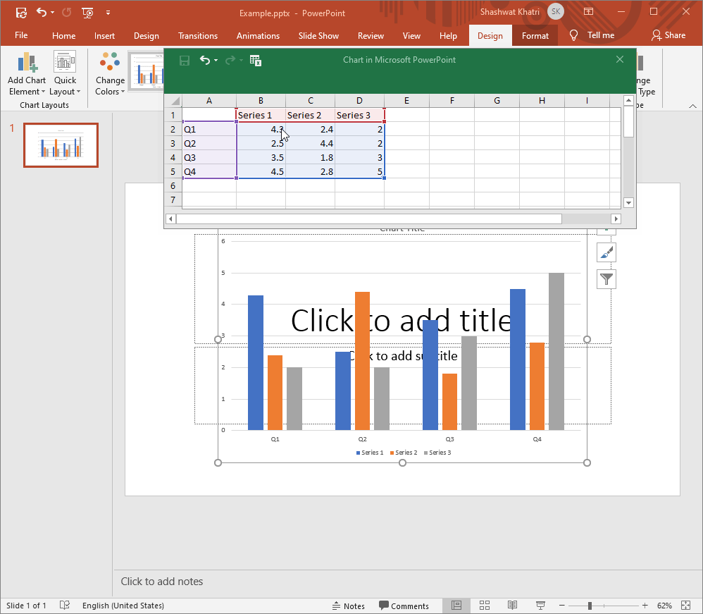
To include them back, drag the purple-blue boxes to cover the data. As soon as you enter the data, the chart will update in real-time to represent it. Close the spreadsheet to see the data reflected in your chart.

If you want to edit the data again, click on Edit Data under the “Design” tab.

And this happens every time you change the spreadsheet values, ensuring the chart stays aligned with the data.
Customize your Charts and Graphs
Once the charts are added to your presentation, you can further customize them to change the look and feel of the chart. Here are a few ways you can change the style of your PPT chart:
Change the style/design
To make your charts and graphs stand out a little bit better, you can choose from a dozen preset styles available. To access them, click on the chart to select it, then under the Design Tab, in the “Chart Styles” section, you will see all the varied styles that you can apply to your chart. Every chart type and variant will have a few preset styles available.

Some of them will add depth to your charts, while others will add a pattern or change the background for the chart to stand out a little bit more. Simply click on one to apply it.

Change chart colors
The option to change the colors of your charts and graphs is found under the same Design tab.

Click on it to open a submenu where you can choose from a variegated palette, divided into two categories – Colorful and Monochromatic. Click on a color to apply it to your chart.

Format chart area
This last customization feature will provide a spate of options for you to format the chart area. To access it, right-click on the chart and click on Format Plot Area.

A new panel will open up on the right. Here, you will get the option to Fill (add background color or pattern to the chart) and customize the Border of the chart.

You can even format the series by right-clicking on one and selecting Format Data Series.

When selected, you will get the option to change the Series Overlap (gap width within a series) and Gap Width (gap width between series).

Furthermore, you can also change the color and effects of the series by clicking on the other two options under “Series Options”.

Adding charts and graphs to your presentation is quite easy once you have the necessary know-how. Not only does it give a much-needed break from a flat text-heavy presentation, but it also encourages visual learning and helps to get the point across better.