Google is planning to come up with a new desktop version for its app storehouse — Play Store.
Currently, while surfing Play Store site on web, the icons appear one after the other at the bottom of the page which neither looks good nor is considered to be user-friendly as very few users scroll it till the bottom of the page.
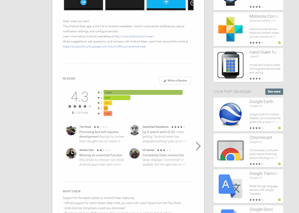
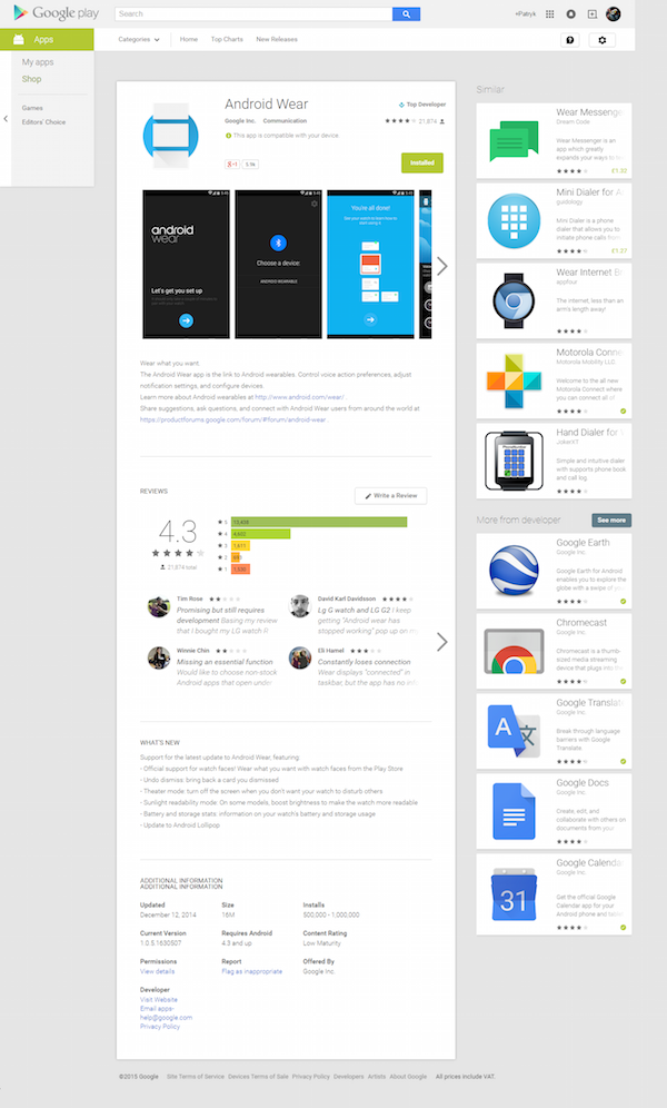
According to sources, Google is experimenting a new layout for the Play Store for a while now. A leaked Screenshot of the test layout of an app’s page Play Store showing similar app suggestions at the right side of the screen which would prove out to be more user-friendly, thereby helping users to discover more apps.
We feel it’s pretty good to have a sidebar on Play Store for app suggestions. What do you think? Let us know in the comments section below.


