The new material design introduced in Gmail for the web in April 2018 is now being injected into the Gmail app for both Android and iOS, with the latest update. The update includes a few tweaks to some of its features as well.
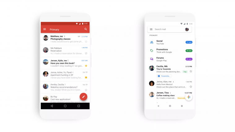
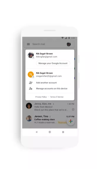
The color combination has been redone. The background is a standard white which is deftly balanced by the variety of colors painting the icons, buttons, and other stuff situated in the foreground. The bold red app bar has been relegated to the background and whitewashed, like the rest of the app screen. Instead, a permanent search bar is stationed on top of the app screen that previously appeared on clicking the search icon present in the app bar. As the search icon became redundant, it was thrown out. Instead, the profile icon has been put in its place.
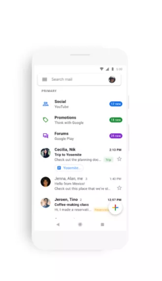
The floating action button has been transformed too: for starters, it’s in white. Secondly, the icon is a ‘+’ sign instead of a pen symbol, which has been imbued with 4 different colors- one per arm of the ‘+’ sign. The horizontal lines marking the end of one email and the beginning of the next in the list have been erased. The three standard categories of emails- Social, Promotions, Forum- have been added to the app, the side-icons of which are painted in 3 different colors.
With this facelift, Gmail seems to have put renewed focus onto its labels, buttons, and icons, previously overwhelmed by the presence of the bright red app bar. Simplicity and sleekness give a contemporary feel to the design.
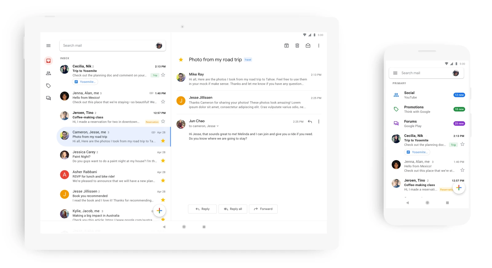
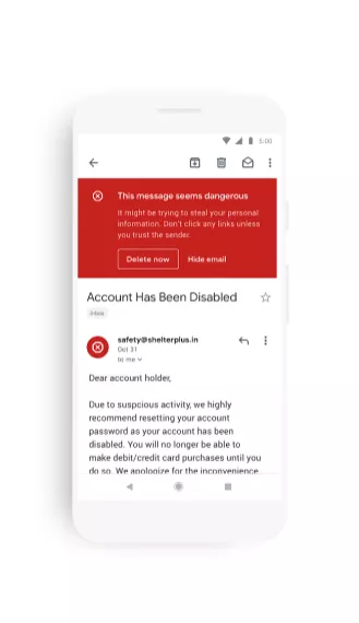
Two features have been introduced. The first one is the presence of received attachments in the conversations list as part of the list itself. With this, attachments are accessible directly from the home page of the app. Secondly, untrustworthy and dangerous messages come accompanied by a terrifying red warning banner taking up one-third of the screen- a signal hard to miss.
Related:
- Gmail Confidential Mode: How to get and use it
- How to enable and disable the Gmail Nudges feature on your Android