It’s always fun playing with a new beta version of Android. The same goes for Android Q too. Even though the Q update isn’t big on UI changes, there are two small changes that spotted already that are winning our hearts.
UI change #1: Position of the drop-down icon in the notification
First up, is a change in the location of the little drop-down icon in notification shade for the notifications that you can expand. Click this icon simply expands the notifications.
While on Android Pie, an update that’s still not available for Galaxy S8 and Notre 8 users in the U.S., the icon was placed right after the title of the notification. So, because of that, its position would keep changing based on the length of the notification, which would vary a lot obviously because of different kinds of applications throwing in different kinds of notifications.
Just have a look at the image above. In the left, you have a screenshot taken on Android Pie, and you can see the position of the drop-down icon changes for each notification.
However, take a look at the position of the drop-down icon in the right part of the image, which is a screenshot taken on Android Q beta. It’s easy to find that the drop-down icon is now fixed at the right side of the notification, meaning it’s ready to become a part of your muscle memory whenever you decide to expand a notification without doing a two-finger swipe. You just have to reach the top right corner of the notification every time, which notification it is from whichever app.
UI change #2: Smart size of suggested settings
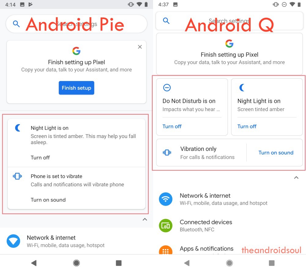
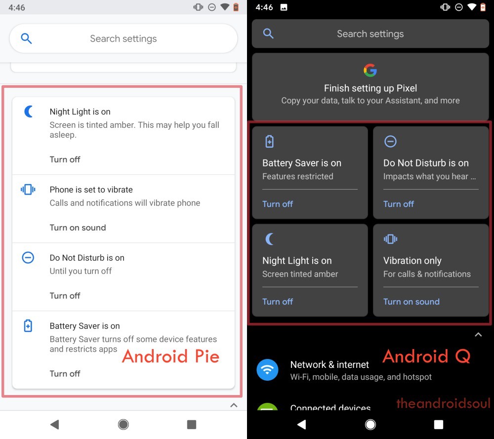
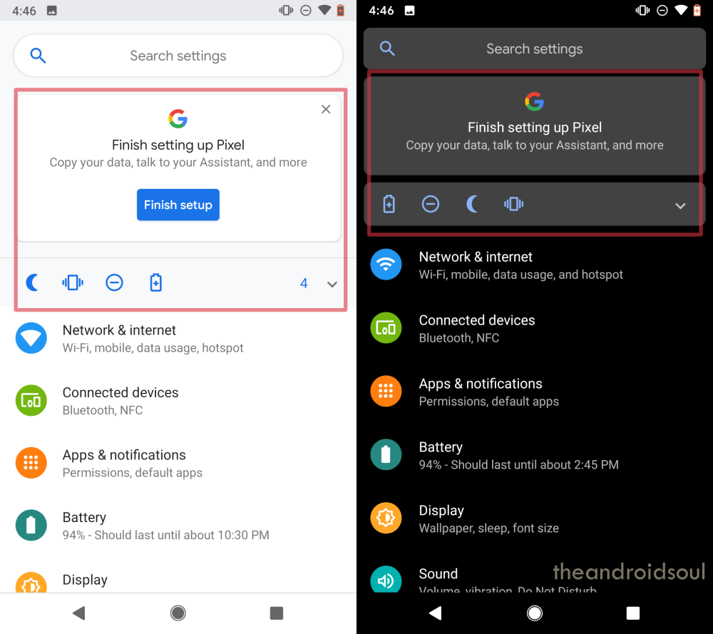
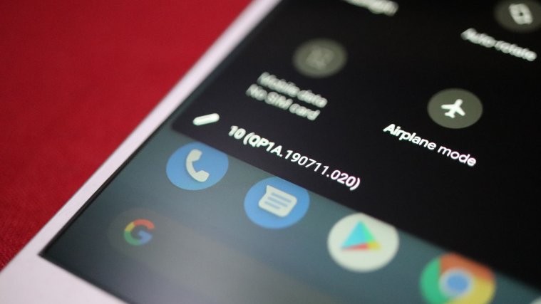
Like Android Pie, Android Q also reminds you at the top of the Settings app if the device is in silent mode, or night light is on, or is DND mode is on, etc. But it does that while occupying much less space.
While on Android Pie, these suggested settings have fixed sized rectangle block that would appear one after another, on Android Q, the blocks change their size to square and small rectangle based on the no. of suggestions available.
Take a look at the Settings screens below for comparison.
Android Q UI example #1
Android Q UI example #2
Android Q UI example #3
What do you think of these small changes in the UI?